Case Study: Clue
During my master’s degree in Interaction Design, I took a course called Emotional Design, taught by Tanel and Sigmund. This course focused on understanding the emotional aspects of digital product design in a world where functionality and usability have been the main priorities for many years. In other words, we were expected to choose a mundane app and improve its design by focusing on emotional elements. After a quick research session, I chose Clue as my app.
About Clue
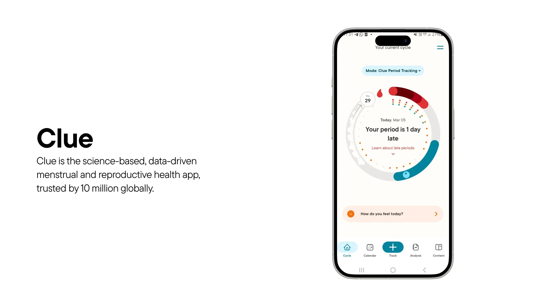
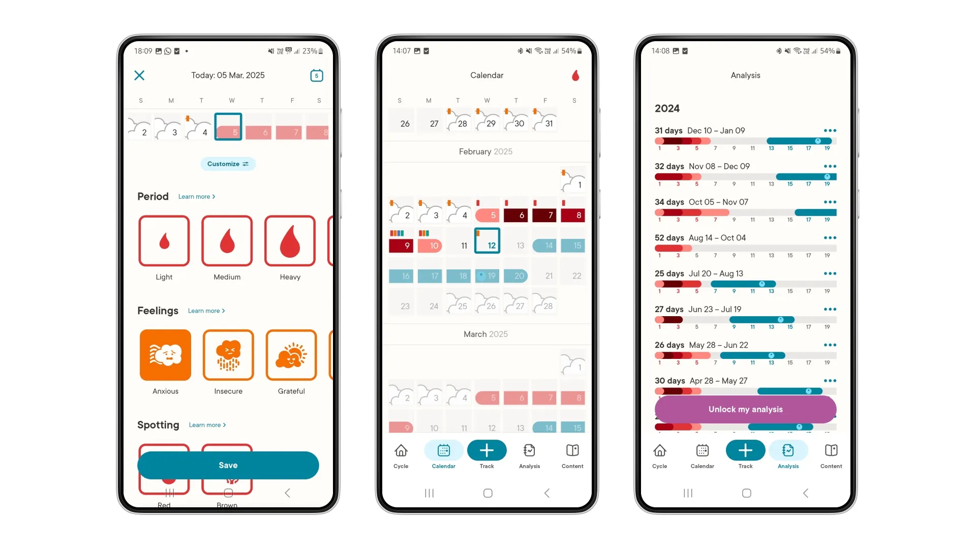
Clue is a period tracker with over 10 million active users worldwide. It offers four different modes: menstrual health, conception, pregnancy, and perimenopause. For the sake of the course’s scope and timeline, I decided to focus only on the basic menstrual health mode in terms of functionality and user base.
Clue is doing a great job
At first, I thought Clue had a great design because it was:
- Useful – it helps users track their periods without any issues.
- Efficient – the main function can be completed with just two taps.
- Trustworthy – it assures users that their data will remain private.
- Gender-neutral and inclusive – it avoids stereotypical or exclusive design choices.
I truly appreciate the values that Clue upholds. For that reason, I defined my first design principle: “No pink, no flowers.” This principle reflects my intention to follow and respect these values throughout my project.
Clue is doing a great job?
If Clue was doing such a great job, then why did I feel so anxious every time I used it?
- It’s always bad news. Every time I opened Clue, it felt like I was opening it to receive bad news—either I had gotten my period, or it was late, or I was checking to see if I was experiencing PMS.
- The red, wired icon—even just seeing the icon—would make me tense.
- Scary messages—Clue didn’t really help with that feeling either. For example, even a message like “your period is 1 day late” could be frightening on its own.
- Hospital feeling. Of course, I also can’t forget the feedback I got from my class presentations—Sofija said Clue felt like a hospital.
So maybe Clue is doing a good job, but not a great job.
“Taking emotions into consideration, differentiates good design from great design.”
A bit of insight
I don’t think that “bad” emotions are bad. Of course, they make us feel bitter, but they are not something we shouldn’t feel. On the contrary, they can show us that something is wrong and guide us to see what it is, so we can work on it and make it better.
Sharing comes with being vulnerable
Then I told myself, isn’t feeling anxious normal? Because Clue is a medical app, maybe it shouldn’t have any responsibility to make users feel a certain way. During one of my conversations with Sigmund, he made me realize that the data users put into Clue is actually personal data, which differs from period flow to how they feel during the day. Sharing so much personal information about ourselves could make us vulnerable. So, users need to feel supported and cared for.
After figuring that point out, finding the “how might we” question wasn’t so hard:
How might we create a caring experience within Clue that acknowledges user’s emotions and supports them when tracking their period?
Slight new designs of Clue
During the design process, I avoided turning Clue into a completely new app. I already found Clue to be quite effective as it was. My goal was to stay true to the existing version of Clue and create the greatest possible impact through small changes.
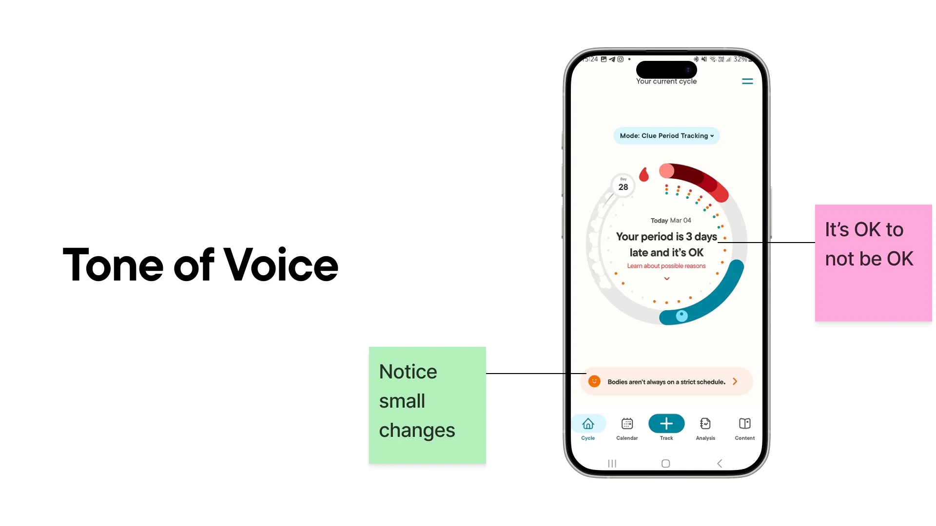
The first change I made was to the tone of voice. Instead of the scary “your period is 1 day late” message, acknowledging that late periods are not uncommon might ease users’ feelings of anxiety.
The button below encourages users to provide data about how they are feeling during the day. Since it shows the same message every time, this text area could be used to display messages about their flow, creating a more personalized experience.
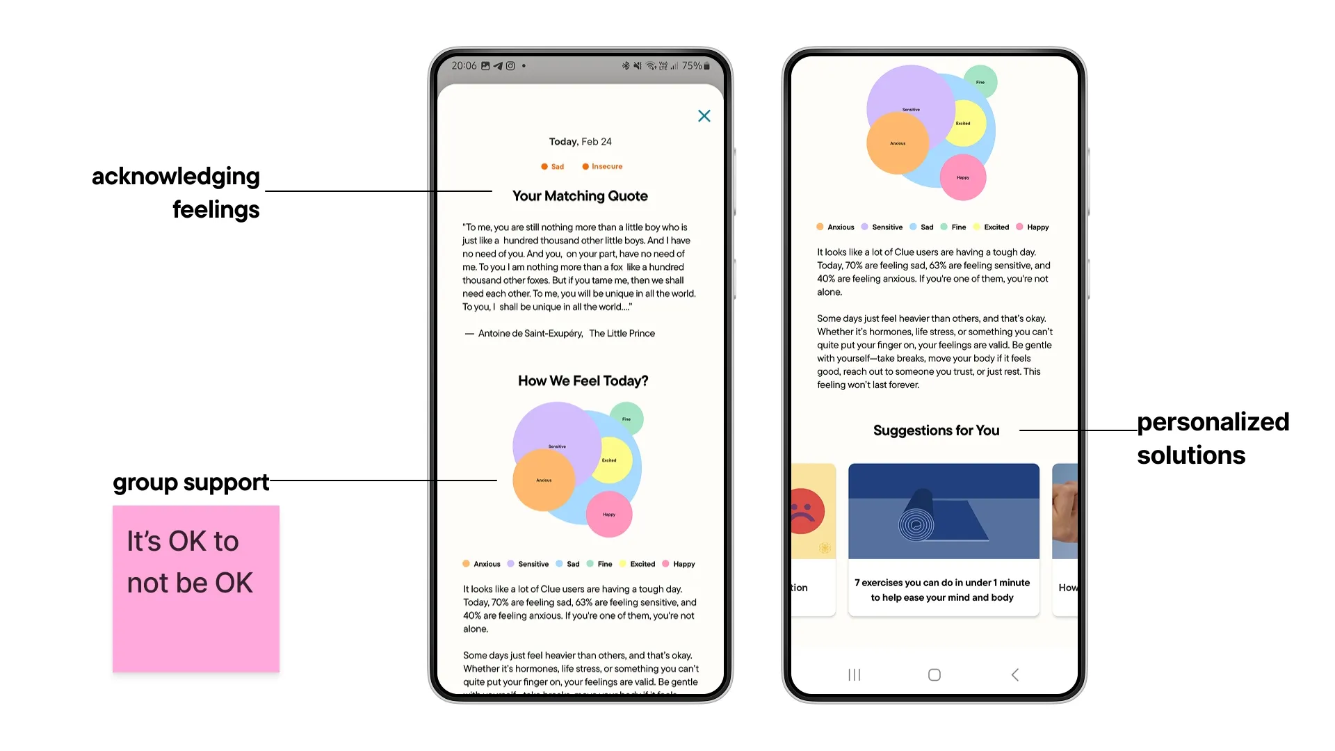
After users enter their data, they are essentially met with a standard screen that isn’t really related to the information they just provided. Instead, a screen that acknowledges their feelings, shows them that they’re not alone in dealing with those emotions, offers personalized solutions, and is enjoyable to explore could create a much better experience.
A matching quote from a book, movie, or series to acknowledge the feelings of users.
Data visualization to show the feelings of other users, providing a sense of group support.
Suggested articles based on the user’s mood and situation to offer personalized solutions.
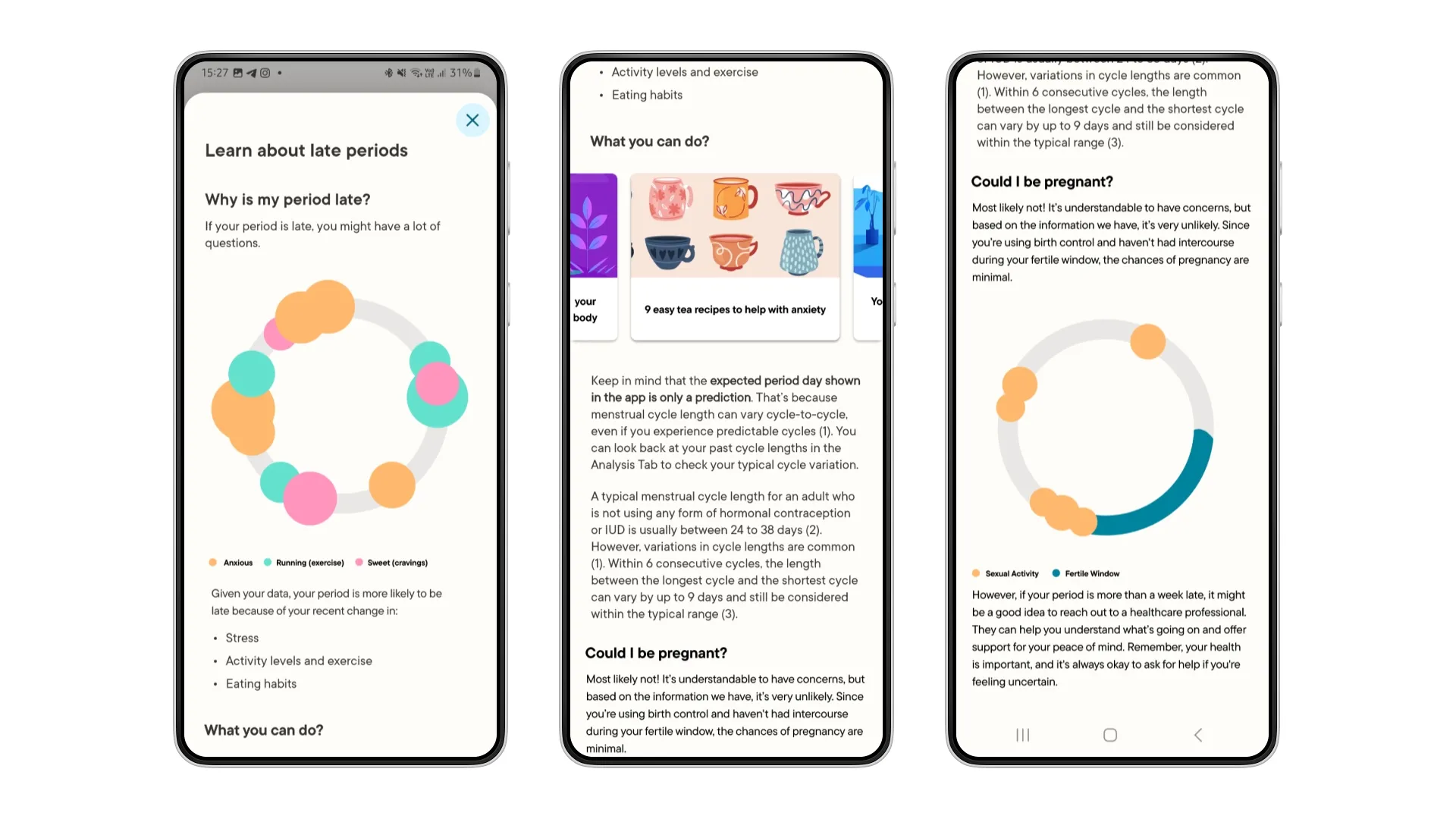
While on the home screen, users can click on the ‘learn more about …’ text. This takes them to a general page with detailed information about the cycle phase they’re in (such as period or PMS), but it’s not personalized. Since Clue collects detailed data from its users, this page could be used to draw and display insights specific to each individual. For example, a delayed period might not be a cause for concern for everyone—if someone has recently changed their eating habits or traveled, a delay could actually be considered normal. This page could use data visualization to show users such patterns and help reassure them that there’s nothing to worry about, preventing unnecessary anxiety.
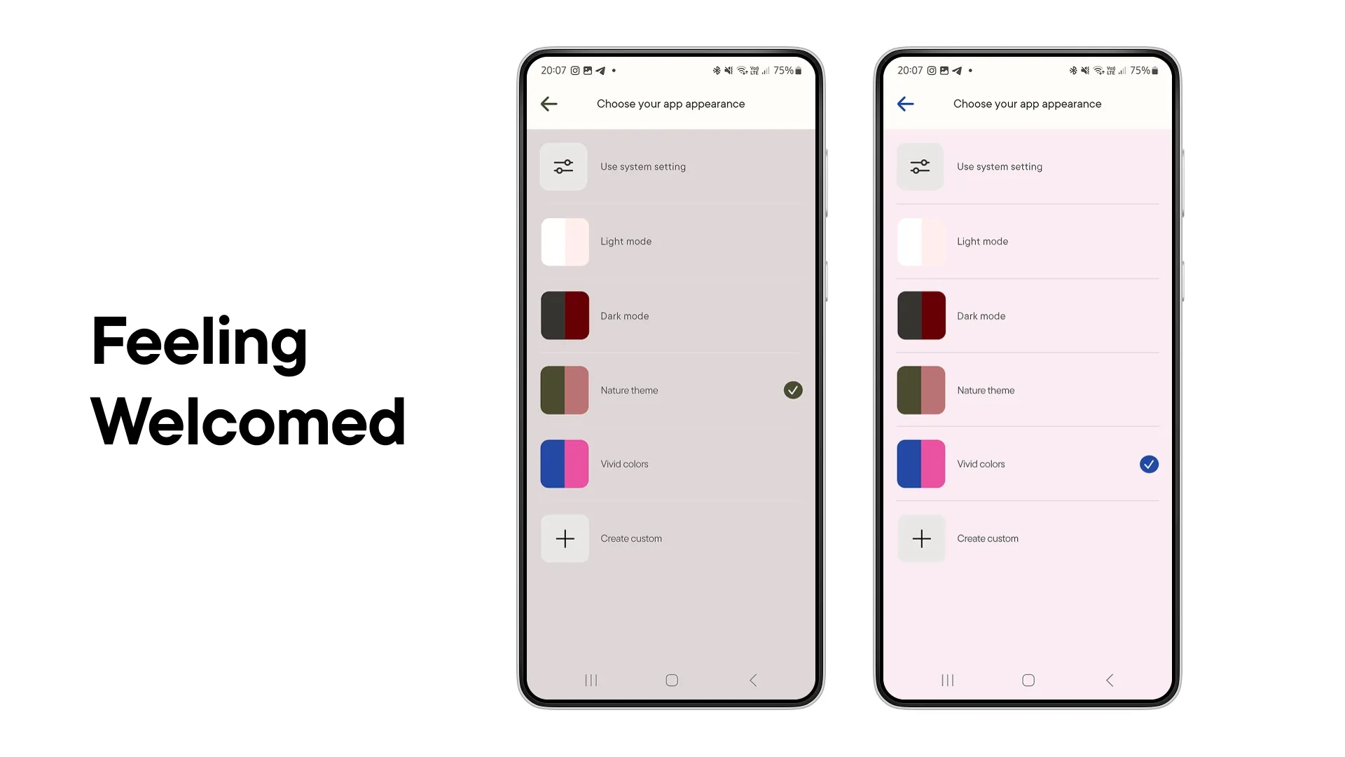
The last change I made gives users the ability to change and create their own color theme for the app’s interface, making them feel welcomed and providing a more personalized experience.
So, what’s next?
The changes I planned to make weren’t limited to these. But considering that this was a solo student project with a set deadline, I made a list of additional changes and topics that need further work.
- User Research: In class, we used the embodied research method, which means we conducted an in-depth analysis based solely on our own emotions and experiences. While I quite enjoyed this method, I believe it would be wise to include a larger user pool.
- Testing: Apart from the positive feedback I received from my coursemates, no user testing was conducted.
- Engaging Experience: None of the designs I created included animations. By focusing more on the UI elements, it might be possible to create a more enjoyable user experience in Clue.
- Cycle Summary: This might sound a bit wild, but I believe that offering users a “Spotify Wrapped-like” monthly summary could add a new layer to their interaction with Clue—helping them become more aware of their own data, encouraging regular use of the app, and making the overall experience more enjoyable.